Monday, 30 April 2012

more finished pieces

Character Turnarounds

Daisy


 Jasmine

Character colour development


Daisy action poses

Vehicle shape development

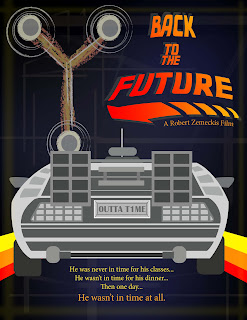
Personal Project
Another design idea for my personal project for remaking 80s classic movies.
Here I wanted to have a sort of washed out feeling to give a nostalgic feeling also I didn't want to put too much information onto the poster because the image speaks for itself. By taking a main element of the movie which is something so identifiable to the audience it doesn't need anything else. I prefer this design to the previous one I did, this one has more of a style and an idea of representing the classics whereas the other one just seemed quite copy cat to previous posters made.


Sunday, 15 April 2012

the personal project

So I've also been working on my Personal project which is redesigning top grossing 80s movies, which happen to be some of my favourite. I'll be uploading some finished ones that I've done in the coming weeks, but here's one anyway :D

Back to the Future
This is my all time favourite movie thats not Disney (for once :D). I wanted to use simple layouts and shapes to create the poster, which is what I'll be doing in my other posters as well. 
I'm thinking of some ways to improve this poster and think up some other ideas i can include in the other posters.


Vehicles - the candy cars

 The Candy Cars

Below are my colour keys and final images for my vehicles. I went for a toffee colour theme in the end for both cars. I really like the colour theme and the roofless car is my favourite, its got a vintage feel about it which I quite like.
The 2nd candy car is quite humorous which I like. It adds a fun element to the design.


More more more!!!

Props

Some more props! Here are some of the girls fave things!!!
Daisy's got her paint brush, colouring crayons and Reggie the Rabbit.
Jasmine's got her flowers, mystery book, camera and spy goggles!


Some more finished backgrounds

So we have another forest background to add to the completed list. I quite like this one and it's good to have another painted watercolour background to go with the other one which should make more sense to viewers about the different styles to represent the 2 different worlds


This is the Greenly Home. Nice and colourful surrounded by the big trees. Lots of bright colours for the target audience. It's not my favourite background that I've done but I still quite like it!


I wanted to try out my 2 characters in a background which I've done in both of the pictures below. I think they look quite nice in them. It's nice to see the images match with the characters!


Saturday, 14 April 2012

Logo design/Props

LOGO Design

So below are some colour keys for my final logo and also some text try outs for my final design. Then there's my final design which I'm really happy with. I think it suits the story well and explains the show well.


So I've started finalising some props for my show. Below are some of the sweets you'll find in the shop and also the pic n' mix bag to fill up with sweets.


Wednesday, 4 April 2012

Character Expressions

Here are some character expression sheets I've done in Illustrator.
Quite happy with the way they turned out.

Daisy


Jasmine